Welcome John the Math Guy blog fans. Today, you can color me embarrassed.
Here is a quote from my recent post on the history of expanded gamut printing: "The earliest instance that I have found..." Did I get called out on my lack of scholarly research on that topic! Not just from one person, but from three people! With multiple examples that significantly predated my lousy excuse for research!


The Math Guy, suitably humiliated
Gary Field
The first person who took me to task was Gary Field, professor emeritus from Cal Poly. Being corrected is embarrassing, of course, but being corrected by Gary Field is almost an honor. I am not saying he has been in print for a long time, but before God carved the Ten Commandments into stone tablets, he hired Gary as a lithography consultant. Gary is known as the author of the printostorical book The Color Printing Revolution: Productivity! Creativity! Quality!, and is a co-author of Pioneers of Modern Offset Lithography.
In his first response, Gary traced expanded gamut 70 years further back than I did. Here is a response from Gary on one of my LinkedIn posts.
Expanded gamut printing goes way back to the early days of process color printing - the 1890s. If you can locate early editions of the Penrose Annual, you will find many beautiful examples.
There were three reasons for employing extra colorants: poor purity process pigments, additivity failure, and proportionality failure. In the early days (pre stochastic screens) moire avoidance was a key constraint. I used to make 6-color separations in the early 60s with proportionality failure correction the objective. Light cyan and light magenta were the extra colors (today they use the same colors in photo-quality inkjet printers). Light and regular magenta (for example) were placed on the same screen angle and the tone scales adjusted such that each colorant provided the highest purity for its respective part of the tone scale.
I looked for information on the Penrose Annual. Wikipedia agrees with Gary. The Wikipedia article says: "Penrose Annuals remain the quintessential record for the development of mass media, advertising, photography, design and typography throughout the 20th century..."

The cover from the second issue of Penrose Annual
So I read though a few issues. The second issue of the Penrose Annual (1896) had an article on the history of three-color printing which is prophetic in view of this blog post:
The three-color process had to undergo the same experiences and difficulties as every new invention. At first one man claimed to have invented quote a new thing, then several others arose and claimed the first right of invention for this; and at last everyone got to know that the new invention was nothing but the old thing known years and years ago, thus confirming the old proverb "there is nothing new under the sun."
(This may be true, but I believe that I was the one who first said this old proverb, I mean, ecclesiastically speaking.)
I did a rudimentary search of the early issues of the Penrose Annual. The first few had articles on printing with three colors. The earliest article I found that referred to more colors was an article comparing the three-color and four-color processes in the 1898 issue. I quote: "the litho printer is taught to produce his ten or twelve color print". Oh! I guess expanded gamut lithographic printing was commonplace in 1898!
Gary goes on to chastise me for my poor research techniques, and also for my prodigious collection of patents:
Most patents, frankly, are worthless. It is not that difficult to locate the "prior art" of some enterprising photolithographer (often in the Penrose Annual).
Of course, over the course of several emails back and forth, Gary felt the need to demonstrate some further prior art. He found a patent for expanded gamut photography that was filed in 1950 in Great Britain: Improvements relating to multicolour photographic reproduction, by Joseph Arthur Ball. I dunno how I managed to miss this one. Pretty lazy of me, really.
Apparently he felt the need to outdo himself -- I mean this is a competition, after all -- and played the trump card: Process of photomechanical reproduction of colors and the resultant article (Charles Zander) which was filed at the US Patent Office in 1905. This is a four-color photographic process, which may not sound all that impressive since printing uses four inks. But his process was with four chromatic pigments: magenta red, lemon yellow, emerald green, and ultramarine blue.
So. I concede. Gary won.
Robin Myers
As if this weren't enough, another good friend, Robin Myers, had his own commentary on my research:
Your latest post on wide gamut printing is very interesting, but it exposes a flaw in performing historical searches using the Internet alone. The Internet is a wide pool, but for historical information, mostly shallow.
Boy, have I been called out on the carpet!
Robin is an archeo-bibliophile and collector of old books. He thanked me for not calling him a pack rat. Robin is also the proprietor of Chromaxion, a repository of color information. If that were not enough, he is the author of SpectraShop, a color acquisition program that I have actually used.
After reading my recent blog, Robin pulled out his copy of Dictionary of Color, published in 1930 by Maerz and Paul. This book was one of many efforts that attempted to provide official definitions of color names by way of color patches. (Earlier color-naming books were from Albert Munsell (1915), Robert Ridgway (1912), Milton Bradley (1895), Johann Ferdinand Ritter von Schönfeld (1794), and A. Boogert (1692). Boy, that sounds like grist for a future blog post!)
After reading my recent blog, Robin pulled out his copy of Dictionary of Color, published in 1930 by Maerz and Paul. This book was one of many efforts that attempted to provide official definitions of color names by way of color patches. (Earlier color-naming books were from Albert Munsell (1915), Robert Ridgway (1912), Milton Bradley (1895), Johann Ferdinand Ritter von Schönfeld (1794), and A. Boogert (1692). Boy, that sounds like grist for a future blog post!)

Available to pack rats through Amazon
I should clarify the images above. The image on the left is a page of delightfully pretty color patches from the book that were printed with two different inks. The image at the right is from the facing page, with a grid, and names of some of the corresponding colors.
Here is what Robin had to say about Maerz and Paul:
Here is what Robin had to say about Maerz and Paul:
After reading your article, I decided to check a copy of “Dictionary of Color” by Maerz and Paul, published in 1930. This book was printed using many more than the standard 4 colors. ... So the techniques of printing with expanded gamuts on press were known well before the 1960’s. I suspect that they were not widely employed for economic reasons.
The authors claimed, and indeed used, 8 chromatic inks and 8 achromatic inks. This I confirmed by spectral measurement with an i1Pro 2 and visual observation with a Beta Color Proofing Viewer II (modified to use white LED illumination). The charts were printed using 150 lpi screens (determined by a Screen Pattern Analyzer and Rescreening Key from RIT).
I was provided with spectra of the inks that were used, that clearly show eight different inks. Robin is nothing if not thorough.
We had an interesting discussion (not a surprise, our conversations are often interesting) about what constitutes expanded gamut printing. The world's oldest book with multi-color printing was the Manual of Calligraphy and Printing, which was first printed in China in 1633. The images were printed with up to ten different inks. Should we consider this gorgeous collection of prints to be expanded gamut printing? We decided "no". This book was block printed, and we decided that to qualify as expanded gamut, it must have halftones.

Robin also dug up some real gems -- early books that showcased a lot of early printing beyond CMYK: A Half Century of Color by Louis Walton Sipley (1951), Practical Color Simplified by William J. Miskella1 (1928).
Mike Strickler
I have relied on Mike for years to help me keep one foot outside the ivory tower. He told me about another expanded gamut effort:
Since you’re on about the history of ECG, I should tell you about a very rational system that was developed about 1978 by a guy I came to know in 2014, when I was hired to replace the system at Shorewood Packaging in North Carolina. The man’s name is Ken Reddick, and apparently around 1978, without any outside inspiration he decided that 4C lithography could be much improved if secondary inks could be added.
He had 8C presses at his disposal at the Queens Litho plant in Indianapolis (later acquired by Shorewood). I believe they printed album covers at the start. Ken reasoned that if he could find strong colors in between the hues of C, M, and Y he could do something useful. He though about it for a moment and then realized that the Pantone base colors Warm Red, Pantone Green, and Reflex Blue fit the bill pretty well.
(He was not interested in abstractions like the greatest overall gamut—he had no way of measuring this in any event—but specific needs of certain customers—and he may have had only 6 colors to start.)
Then he separated a bunch of Pantone-like patches varying the percentages of the (max) 3 likely constituent colors, building a sort of ring-around chart, printed these, holding density and dot gain steady, chose the best matches visually, and built his lookup tables. I still have one of those color books. Given the limitations of the era—no spectro to measure color difference, no color conversion software--he succeeded wildly. Designs had to be rebuilt object by object, and there was no solution for images other than (if anyone asked for it) making touch plates conventionally. But hey, this was great stuff!
I guess this trounces the myth that Hallmark Cards invented the whole expanded gamut thing. Who started that silly myth, anyway!?!?
We had an interesting discussion (not a surprise, our conversations are often interesting) about what constitutes expanded gamut printing. The world's oldest book with multi-color printing was the Manual of Calligraphy and Printing, which was first printed in China in 1633. The images were printed with up to ten different inks. Should we consider this gorgeous collection of prints to be expanded gamut printing? We decided "no". This book was block printed, and we decided that to qualify as expanded gamut, it must have halftones.

I could not find a copy of this from Amazon
Robin also dug up some real gems -- early books that showcased a lot of early printing beyond CMYK: A Half Century of Color by Louis Walton Sipley (1951), Practical Color Simplified by William J. Miskella1 (1928).
Mike Strickler
I have relied on Mike for years to help me keep one foot outside the ivory tower. He told me about another expanded gamut effort:
Since you’re on about the history of ECG, I should tell you about a very rational system that was developed about 1978 by a guy I came to know in 2014, when I was hired to replace the system at Shorewood Packaging in North Carolina. The man’s name is Ken Reddick, and apparently around 1978, without any outside inspiration he decided that 4C lithography could be much improved if secondary inks could be added.
He had 8C presses at his disposal at the Queens Litho plant in Indianapolis (later acquired by Shorewood). I believe they printed album covers at the start. Ken reasoned that if he could find strong colors in between the hues of C, M, and Y he could do something useful. He though about it for a moment and then realized that the Pantone base colors Warm Red, Pantone Green, and Reflex Blue fit the bill pretty well.
(He was not interested in abstractions like the greatest overall gamut—he had no way of measuring this in any event—but specific needs of certain customers—and he may have had only 6 colors to start.)
Then he separated a bunch of Pantone-like patches varying the percentages of the (max) 3 likely constituent colors, building a sort of ring-around chart, printed these, holding density and dot gain steady, chose the best matches visually, and built his lookup tables. I still have one of those color books. Given the limitations of the era—no spectro to measure color difference, no color conversion software--he succeeded wildly. Designs had to be rebuilt object by object, and there was no solution for images other than (if anyone asked for it) making touch plates conventionally. But hey, this was great stuff!
I guess this trounces the myth that Hallmark Cards invented the whole expanded gamut thing. Who started that silly myth, anyway!?!?
Don Hutcheson
You have not lived until you have been corrected by Don Hutcheson. Here's his contribution:
The one outstanding ECG pioneer to whom you give no credit is the diminutive, be-monicled Moulin Rouge poster child, Henri de Toulouse-Lautrec.
For the Moulin Rouge (and probably other clients) Lautrec hand-drew posters with a grease pencil and chalk on litho stones that were then printed with an early approximation of CMY inks. After pulling a proof, he would often add extra stones printed in custom-mixed pastel inks, until he’d achieved his desired effect.
It’s not that Lautrec was an inventor, it’s just that, as an artist, he was using the then most common approach to color printing.
IS this expanded gamut printing or not? I dunno.
Larry Goldberg
The mention of the Beta Color Proofing Viewer leads us to the next person to expose my inadequacy in the field of the history of science, Larry Goldberg. Larry runs Beta Industries, which was mentioned by Robin. Note that this email was the second email that I received that mentioned a rat.
I thought I smelled a rat, or at least a fish.
Mr. Kippers (his pseudonym didn't fool me for a minute) color system reminded me of a system that I actually saw, and met the inventor thereof.
When there used to be a very good printing trade show in Long Beach, CA called the Gutenberg Festival a fellow came around with a sample of an additive color printing method.
It used fluorescent inks and a black keyline. Newspapers, always famous for their print quality, could run cartoons in full additive color, and just keep running the black-only image if they ran out of dayglo ink.
The inks are quite opaque, as the substrate offers no benefit. White was the result of tri-color adjacent bits.
The guy's name was WEAKLY or WEEKLY, but my USPTO searches never produced a hit. He also had a patent that he said was the ONLY one that used the term "Dick Tracy" in describing a wrist-worn electronic signalling device. Little did he know the Apple Watch was just 30 years around the bend.
Larry eventually found the patent. Here is a link: Mosaic additive reflectance color display screen.
The Mosaic Screen Plate
I am going to explain Weekley patent, but lest one get confused, first I need to explain Larry's comment about the Kueppers patent. Kueppers' patent combined two interesting concepts. The first concept was about using more inks than just CMYK for printing. The second concept was about creating color my placing little color patches adjacent to one another, but not touching. This is known as additive printing. Larry was commenting that he remembered hearing about a patent for another process that used non-overlapping patches. He wasn't claiming that this invention had much to do with going beyond CMYK. (Although, Weekley did use fluorescent versions of CMY. Odd that he didn't mention fluorescent black ink.)
Weekley's patent was an improvement to a process that was invented in 1868, called the mosaic screen plate. This is an interesting bit of history and technology.
Ducos du Hauron was a pioneer in the field of color photography. In 1862, he invented the idea of the mosaic screen plate as a way to take color photographs using black and white film. This glass plate is a set of really tiny filters of red, green, and blue. The back side of this plate was covered with a normal photographic emulsion, containing silver halide, which would normally produce a black and white photograph.

Mosaic filter plate
(color scientist's conception)
When taking a picture, the emulsion was exposed from the front side, that is, through the filters. Thus, on the back side, there were areas where the emulsion had been exposed with only red light; others where the emulsion had been exposed by only green light, and still other areas where the emulsion had been exposed with only blue light. The individual areas were thus indicative of the amounts of red, green, and blue light in the image.
The emulsion on the plate was then developed with a positive process -- areas where light hit would be white, areas with no light would be black. When the developed plate was viewed (with the filters still intact) the intensity of the light reflected through the red, green, and blue filters would be in accordance with the amount of red, green, and blue light that was in the exposing image.
I was careful in my wording before. I said that du Hauron invented the idea of the mosaic screen plate, for which he was awarded a French patent in 1868. As you might imagine, those mosaic filters are kinda hard to build. Here is an interesting factoid about patents: you are not actually required to build the invention to get a patent. All you need to do is describe it in enough detail so that "one skilled in the art" could build it.
The first commercially successful implementation of du Hauron's invention didn't occur until 1903, with the Autochrome Lumière. The Lumière brothers figgered out how to make this mosaic screens. They sifted potato starch grains to a uniform, microscopic size. For the logophiles in the crowd, this process is known as elutriation. For the people who aren't really all that fanatical about words, the process is known as sifting.
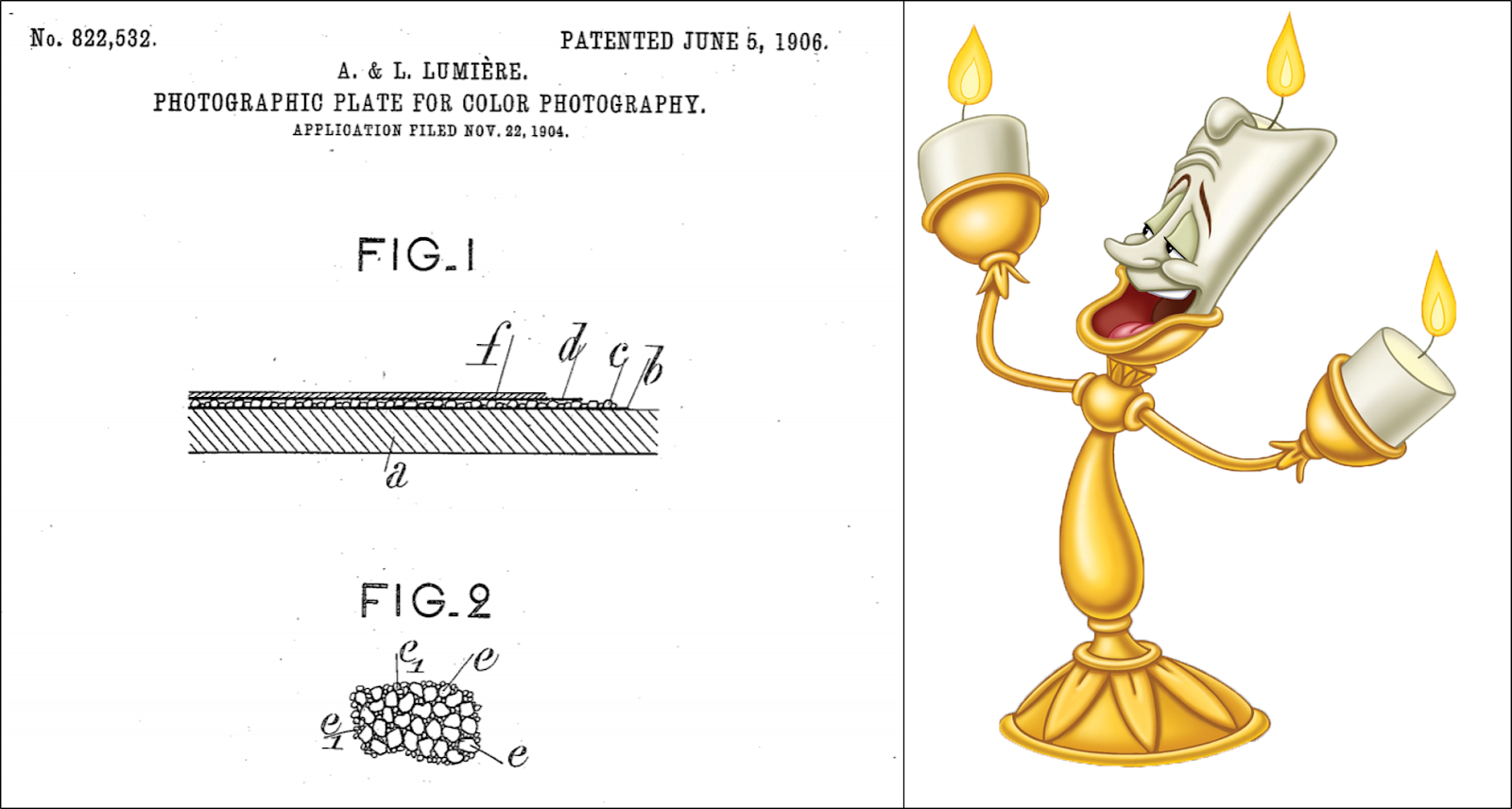
One of the Lumiere brothers, proudly posing with the US version of their patent
They then dyed batches of the grains in each of the three primary colors. These grains were then mixed, and deposited, one layer deep, on a glass plate with black pitch between the particles. This mixture was pressed between glass to flatten out the grains to cover more area. Thus, they had a mosaic. It did not have a regular pattern as in my drawing above, but that didn't matter. Each grain was too tiny to see anyway. All that mattered is that the silver halide on the back side remained in register to the colored grains on the front side.
One problem with the mosaic screen plate was that the final film was rather dark. Imagine that the original exposure was with white light. The red pixels would all be bright red; the green pixels would be all green; the blue pixels would be bright blue. But when viewed under white light, two-thirds of the light that hits the plate gets wasted. Any green or blue light what hits the red filter would get absorbed by the red filter.
This is the problem that Weekley addressed through various methods. Fluorescent inks was part of that. I won't get into the rest.
Addendum to the Addendum
I want to give my sincere thanks to each of today's contestants of John Doesn't Know His Mosaic Filter Plate From a Hole in the Ground! All seriousness aside, I think this history stuff is pretty cool, and appreciate the additional information.
In order to at least partially redeem myself, I feel the need to challenge Weekley's comment about being the only patent with the term "Dick Tracy". I did a bit of searching and found a few that predated Weekley's patent.
Telephonic unit with battery power auxilliaries, April 23, 1957
Wrist carried radio set, May 1, 1962
Method of manufacturing recording heads, November 19, 1968
Apparatus for forming artistic patterns, July 8, 1969
The dates listed are when the patents were granted, that is, published for all the world to see. Weekley's patent was filed in 1979, so he gosh darn shoulda known about these! Was that too harsh? Maybe I'm just jealous that none of my patents are cool enough to mention Dick Tracy.
Also worth looking at this 1987 patent from Crosfield Electronics: https://patents.justia.com/patent/4774567
ReplyDeleteIt covers the use of a special color plate in conjunction with CMYK for package printing.
Chris Lynn (chris@hillamtech.com)
I'm impressed, Chris! Thanks for sharing.
Delete